Circadia Health
Circadia
An AI monitoring platform for care teams — it flags early signs of a resident's decline and explains why, so nurses know who to check first.
- Role
- Product Designer
- Client
- Circadia Health
- Focus
- Healthcare, AI
The challenge
Care teams have to spot which residents are quietly getting worse, across many rooms and a busy shift — and every alert has to be quick to understand and safe to act on.
The outcome
A calm, responsive product across desktop, tablet and mobile: a short list of flags to review, AI summaries clearly labelled as AI, and designed states for loading, offline sensors and errors.
How it came together
The process
- 01
Home
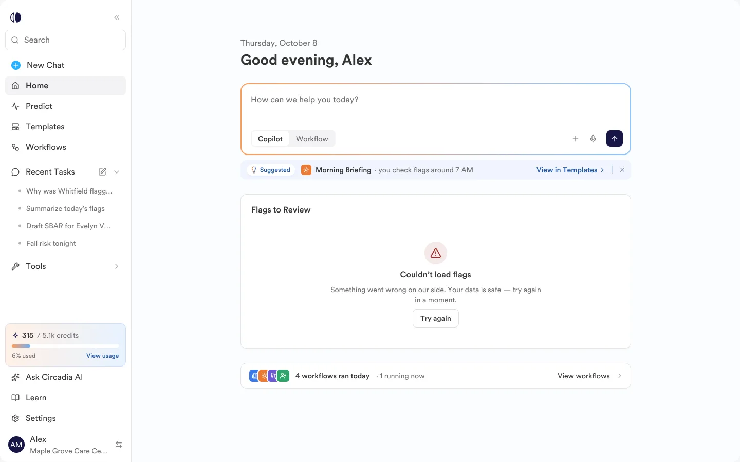
A calm start to the shift
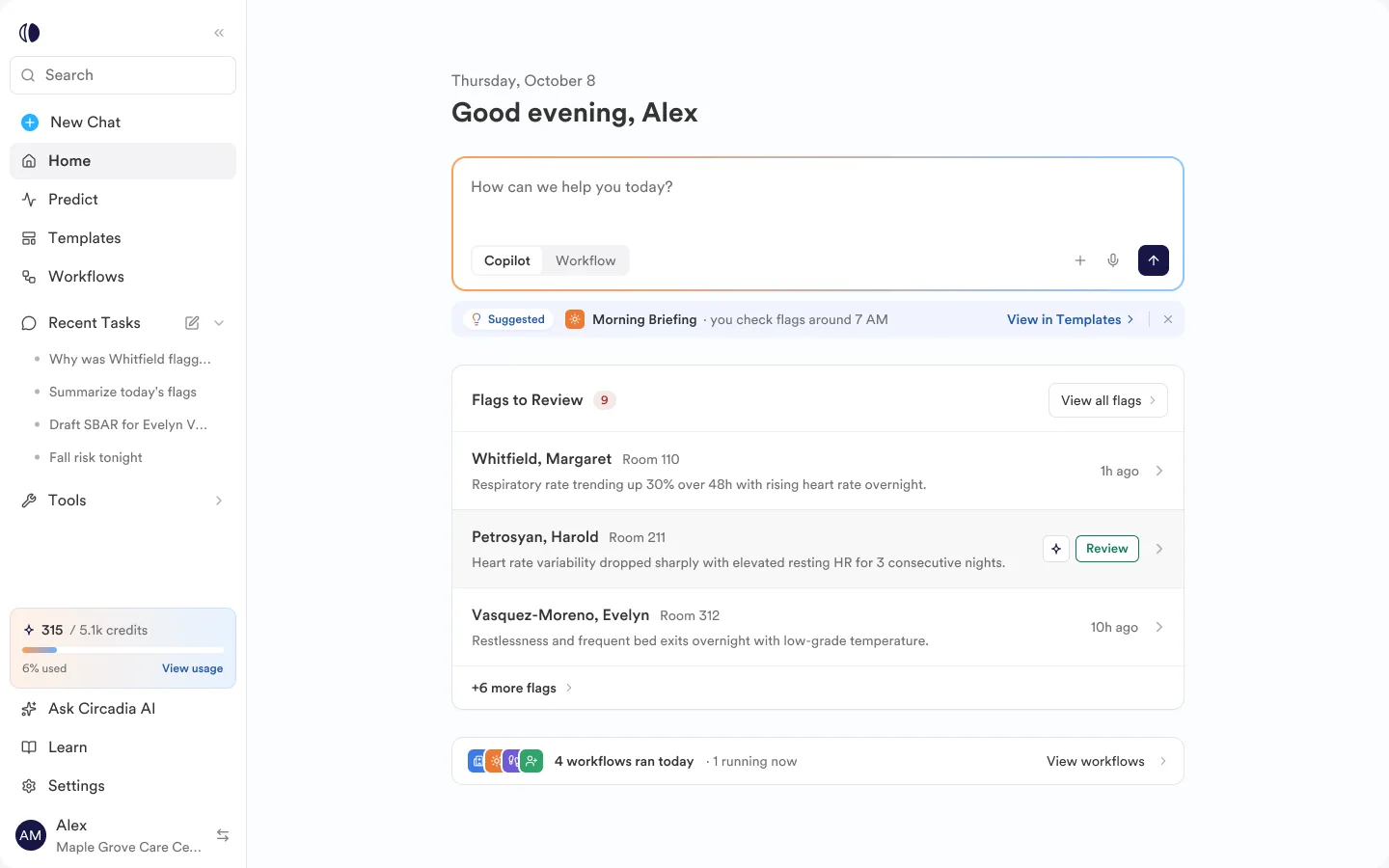
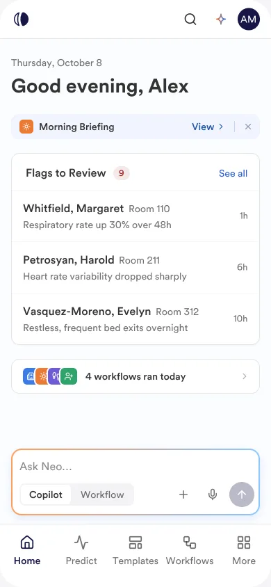
Home answers one question: what needs me right now? A greeting, a single place to ask the AI, the few flags waiting for review and today's workflows — nothing else competing for attention.
- Home — desktop
- Home — mobile
- 02
Predict
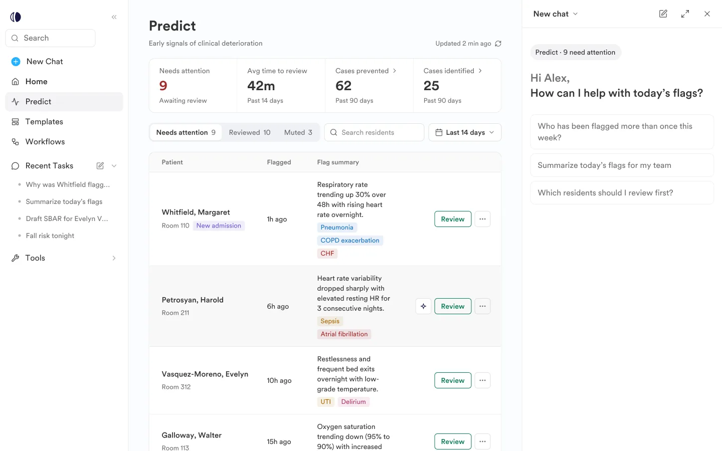
Early signals, one list
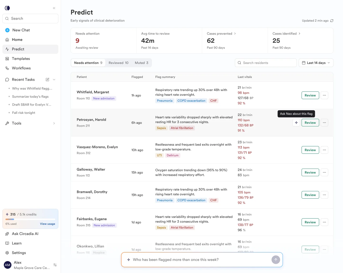
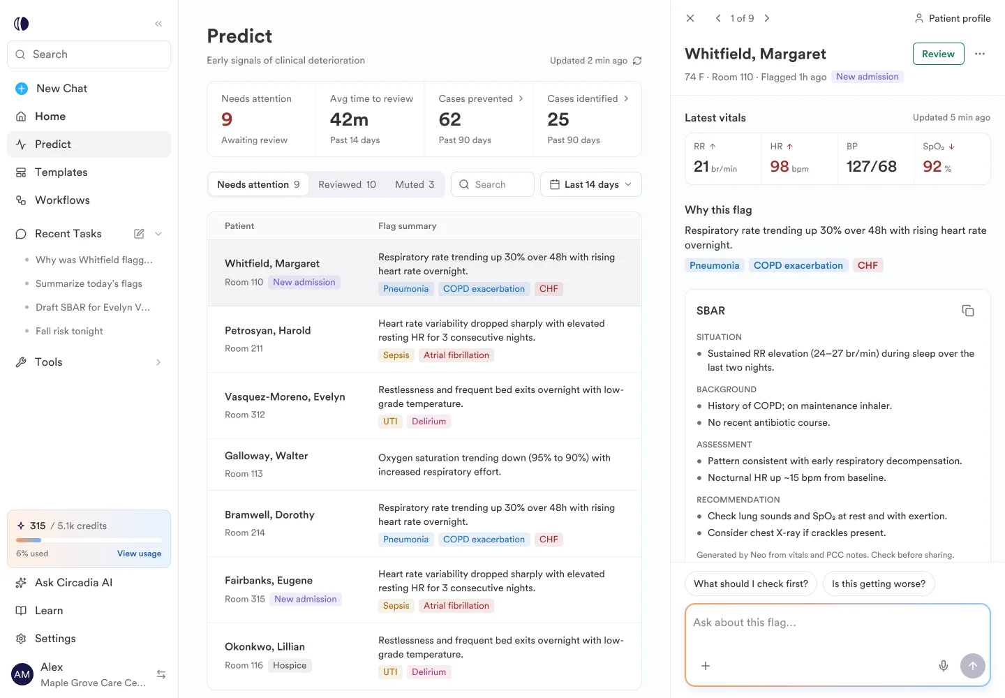
Predict lists every resident the system has flagged, with the latest vitals and condition tags right in the row. Opening a flag slides in a panel with the reason and an SBAR summary, so the nurse can review without losing the list.
- Flag list
- Flag peek panel
- SBAR summary
- 03
Patient
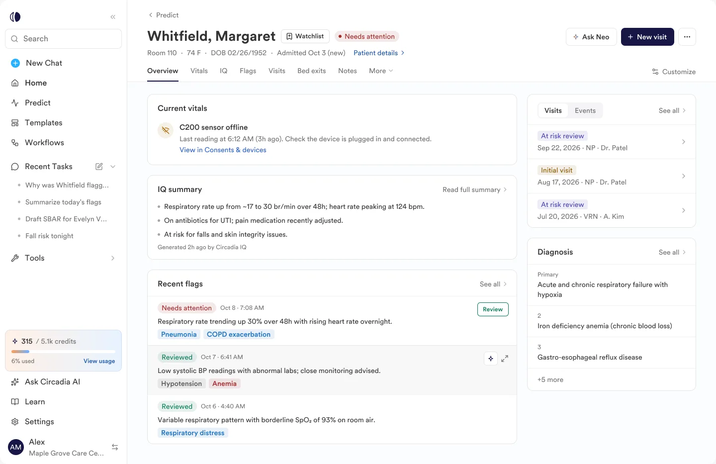
The whole picture on one page
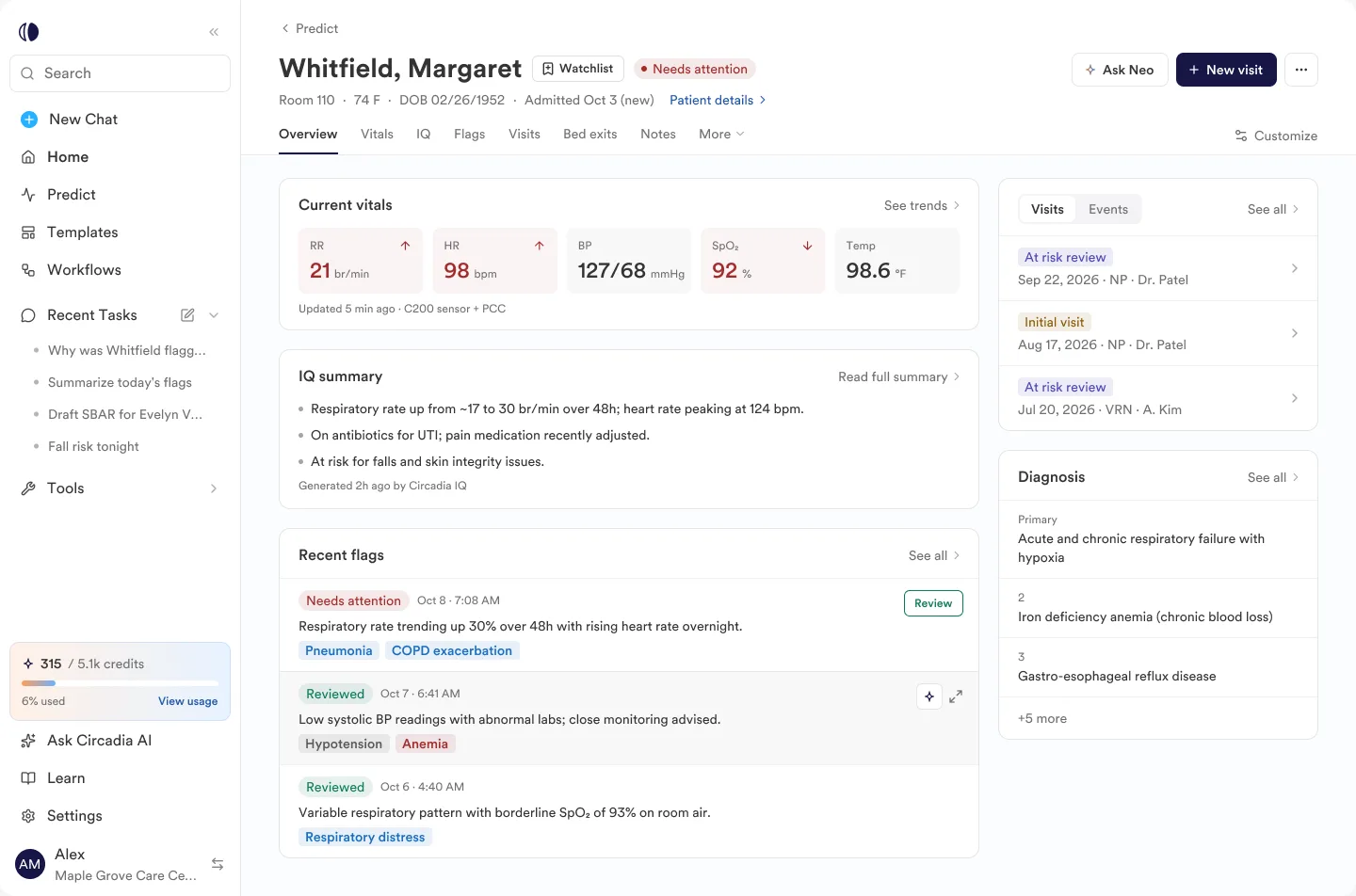
The patient profile brings current vitals, an AI summary, recent flags, visits and diagnoses together, with tabs for the detail behind each.
- Patient overview
- Tabs: vitals, flags, visits, notes
- 04
AI
An assistant that stays in context
Neo, the AI assistant, opens beside the page instead of replacing it, starts from questions about what's on screen, and reminds people that it can make mistakes.
- Neo chat panel
- Suggested prompts
- 05
States
Designed for when things go wrong
Every screen has its loading, empty, offline and error states — a sensor that stops reporting or a list that fails to load says so plainly and tells people what to do next.
- Loading
- Empty
- Sensor offline
- Error
Why it looks like this
Key decisions
01
Fewer things on Home
A lighter Home — one suggestion, a short list of flags, workflows in a single line — so the first screen of a shift is calm, not crowded.
02
Review without leaving the list
Flags open in a side panel with a sticky Review button and a pager between flags, so a nurse can work through them in order.
03
AI is always labelled
SBAR summaries are marked as AI-generated and Neo carries a reminder to check clinical details — trust comes from being clear about what the AI wrote.
04
Nothing floats over the data
On Predict, rows got shorter, vitals got labels and nothing sits on top of the table, so the numbers are always readable.
The rest is under NDA
The full Circadia screens can't be shared publicly. Book a short call and I'll walk you through the work.
Book a call to see moreNext project
Seerlinq HeartCore
A mobile app that guides doctors and nurses through a wearable heart measurement — from choosing the patient to a clear Normal or Elevated LVP result.
View case study