Seerlinq
Seerlinq HeartCore
A guided mobile app for running heart-failure measurements with a wearable device, built for doctors and nurses inside hospitals and care facilities.
- Role
- UI/UX Designer
- Client
- Seerlinq
- Focus
- Healthcare, Mobile App
The challenge
A device measurement only works if every step happens in the right order — patient details, symptom questions, blood pressure and weight, then readings standing and lying down. Caregivers need a tool that leads them through it without mistakes, often while attending to the patient.
The outcome
A five-step guided flow that takes a caregiver from patient selection to a clear Normal or Elevated LVP result, plus patient records and history so every measurement can be reviewed later.
Press playWatch it, then try it
See it in action

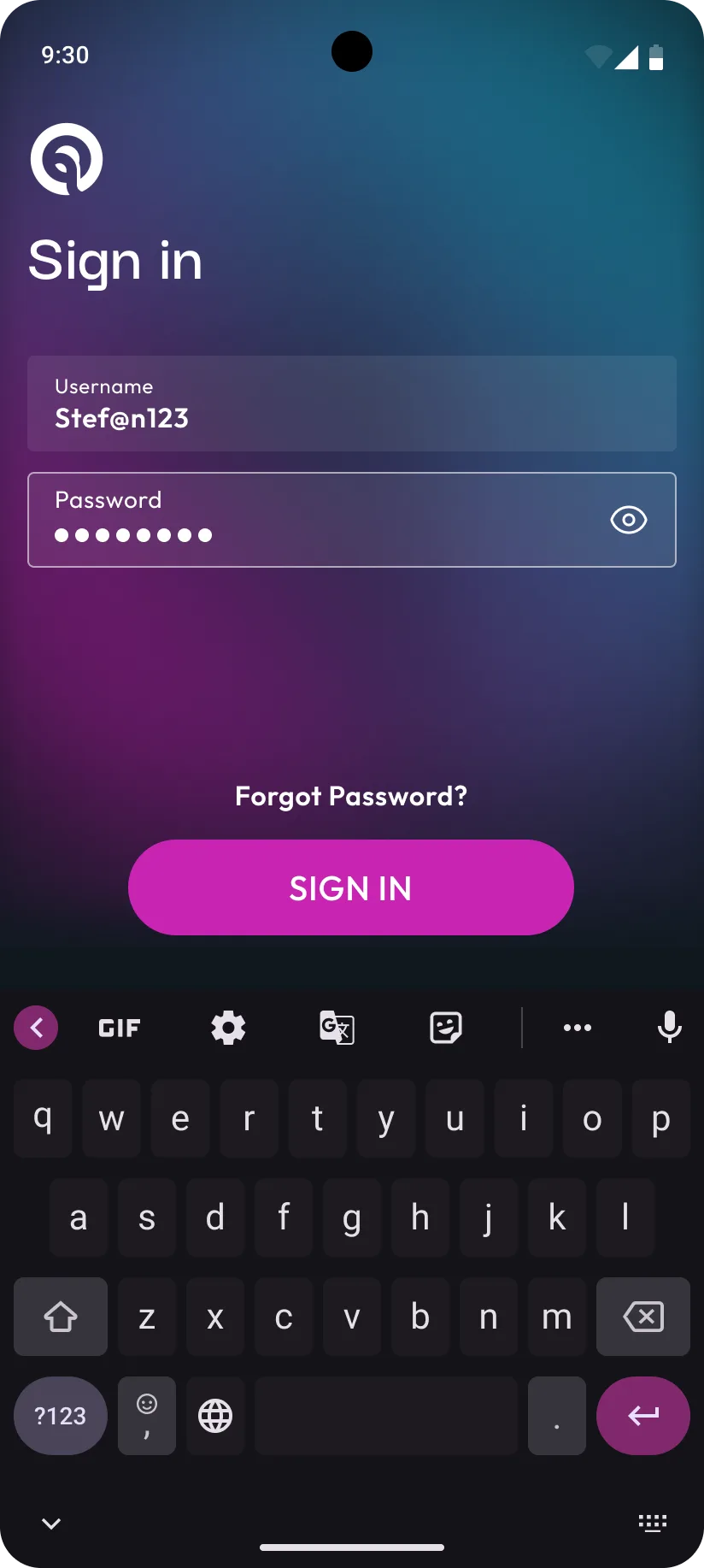
Splash
How it came together
The process
- 01
Map
Mapping the measurement
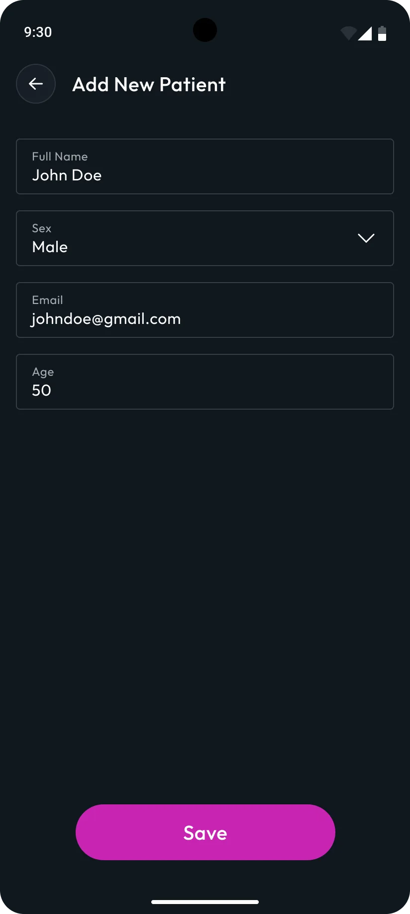
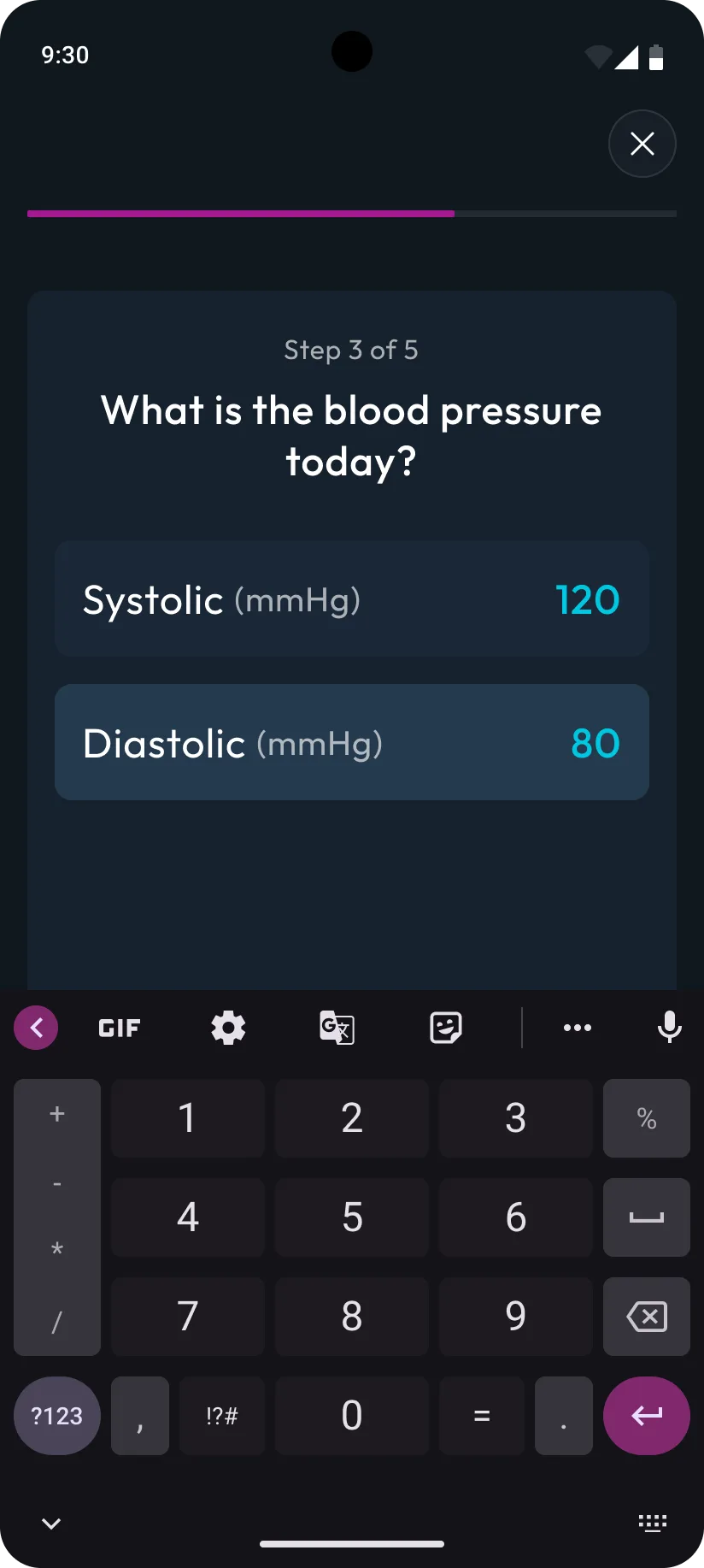
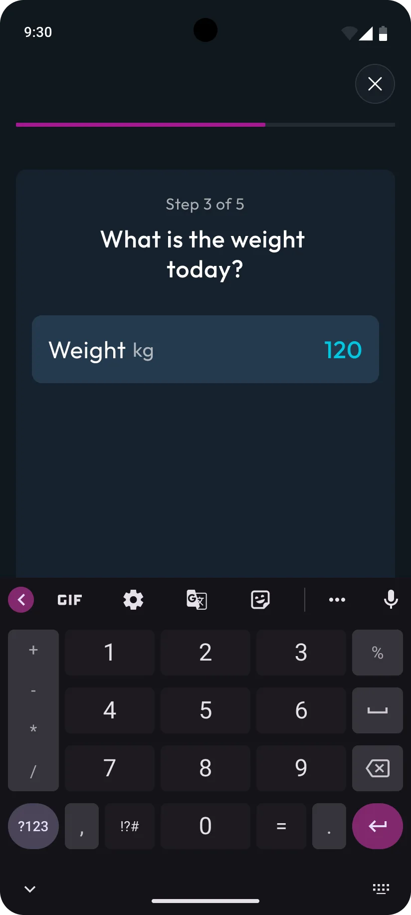
Breaking the clinical procedure into the exact sequence a caregiver follows: select or add the patient, answer the symptom questions the device needs, record blood pressure and weight, then take readings standing and lying down.
- Procedure flow
- Screen inventory
- 02
Guide
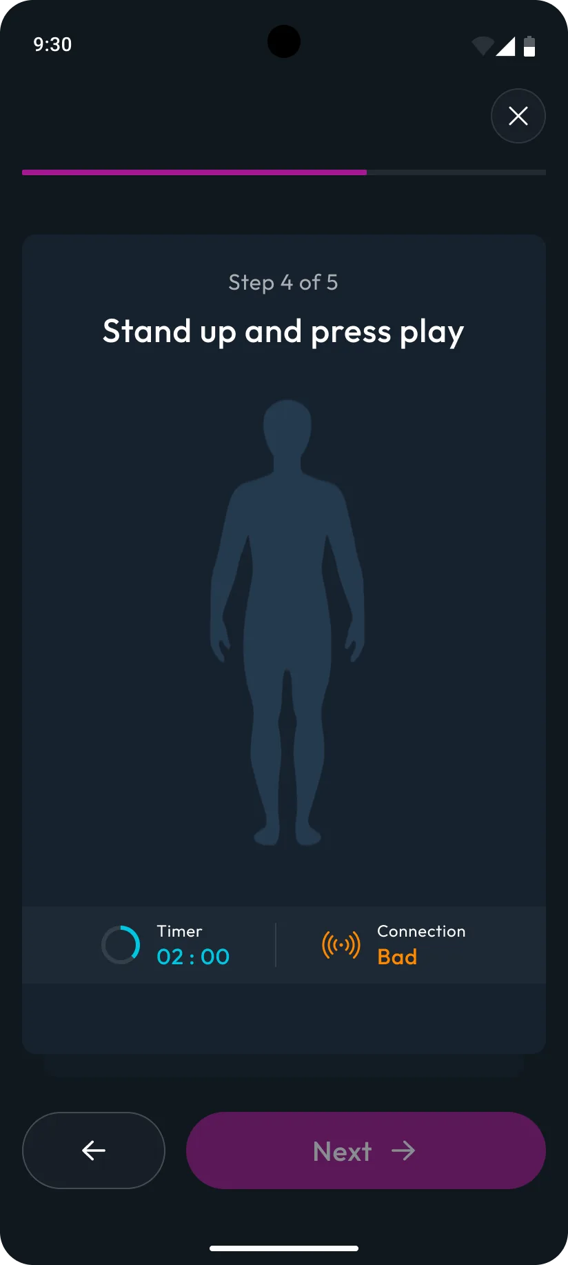
A step-by-step measurement flow
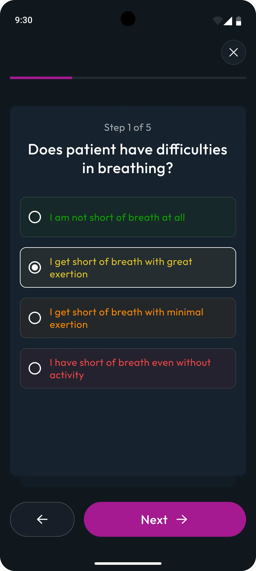
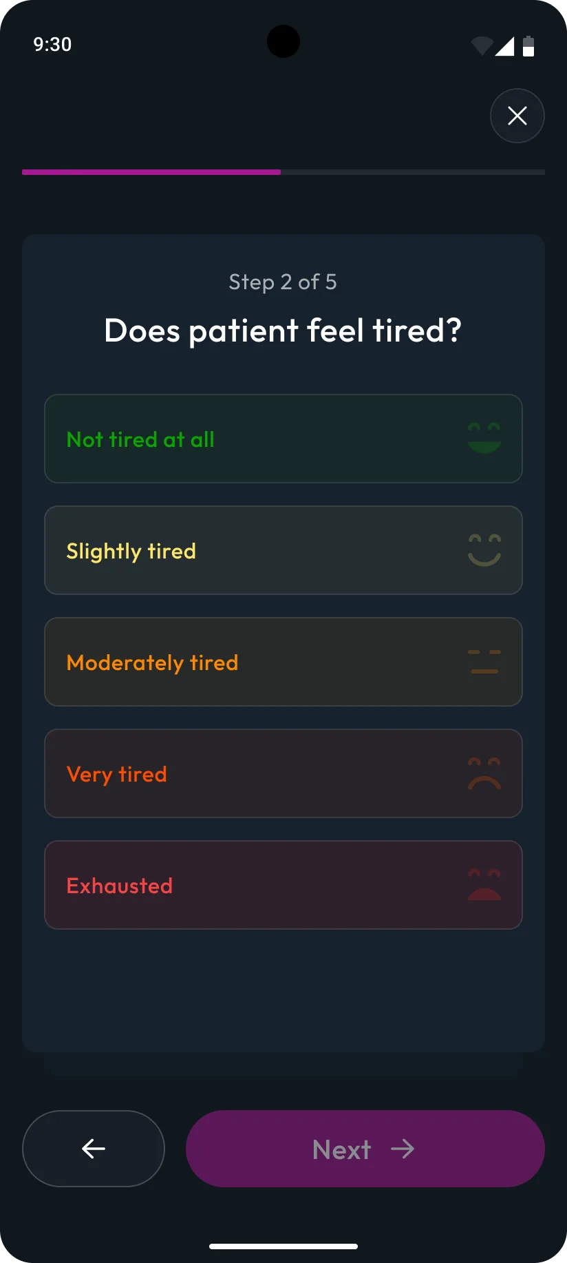
One question or action per screen, a progress bar and 'Step x of 5' so caregivers always know where they are, with Back and Next on every step and a clear way out.
- Step screens
- States: empty, entered, measuring
- 03
Review
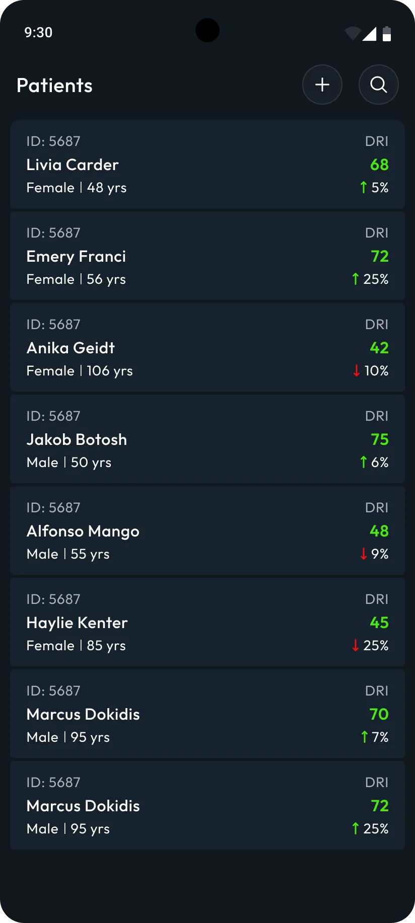
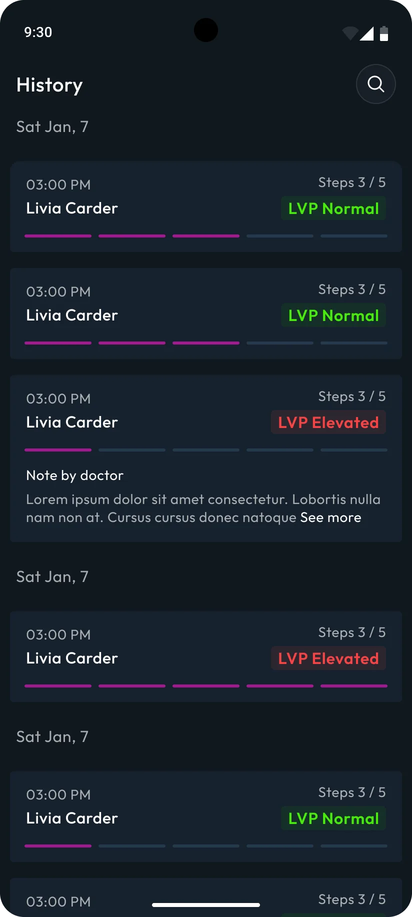
Patients, records and history
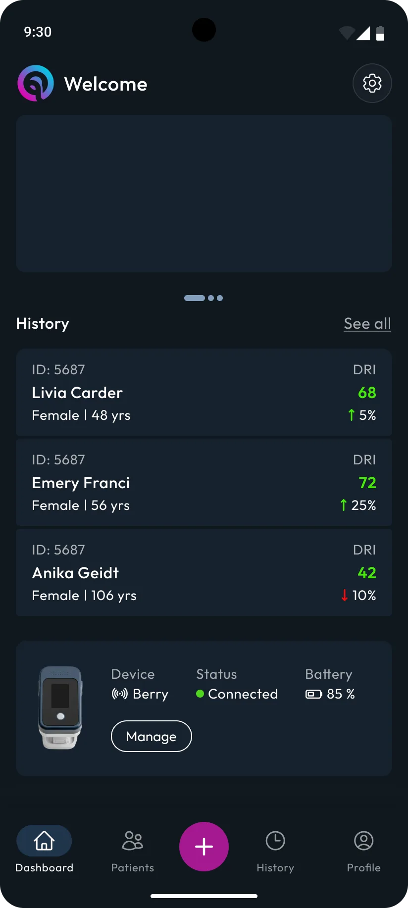
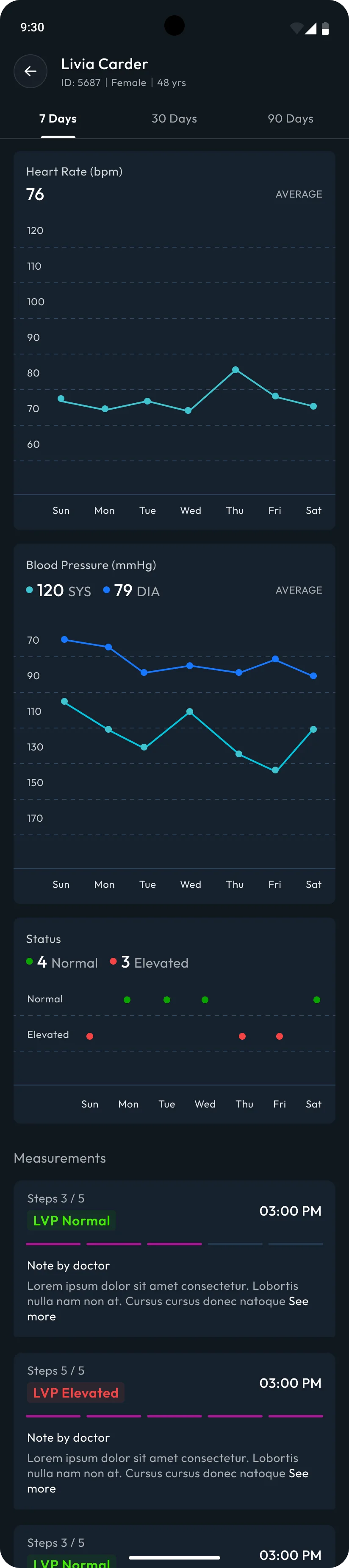
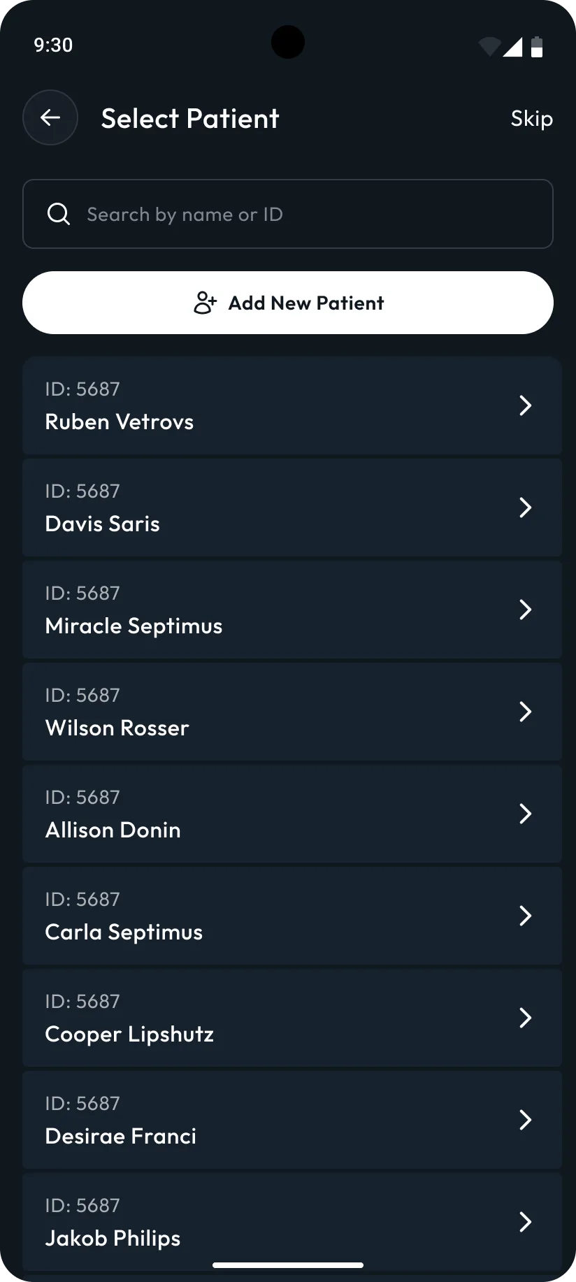
A searchable patient list with each person's latest reading and trend, a patient record with charts over time, and a history of every measurement — normal or elevated — for follow-up.
- Patient list
- Patient record
- History
- 04
Result
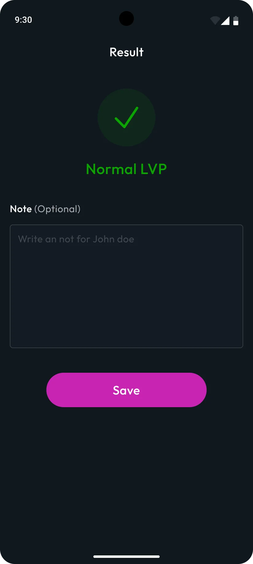
A result you can act on
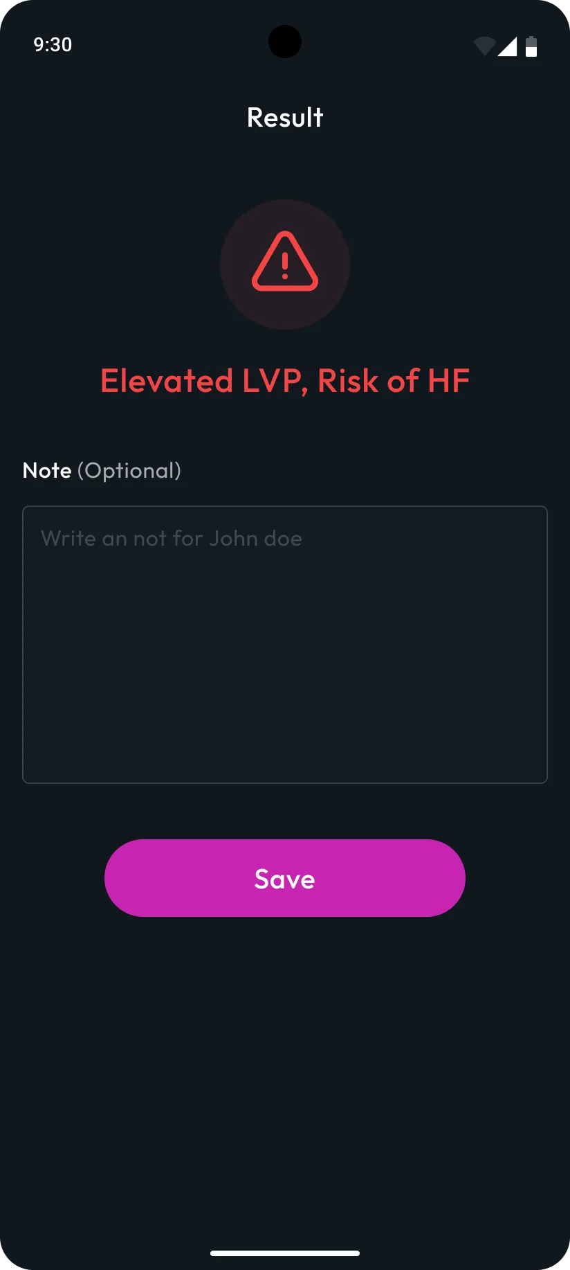
The measurement ends on one clear outcome — Normal LVP or Elevated LVP with a risk warning — and room for an optional note before saving.
- Result states
- Notes
Why it looks like this
Key decisions
01
One question per screen
The measurement is a medical procedure, so each screen asks for exactly one thing. Big answer targets, 'Step x of 5' and a progress bar keep caregivers oriented even when they look away to the patient.
02
Instructions the patient can follow
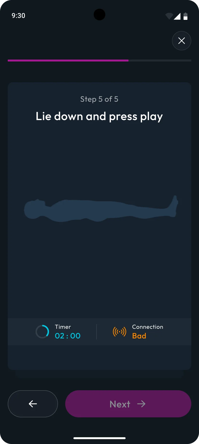
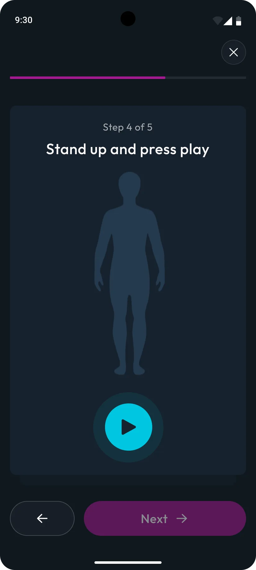
Steps 4 and 5 show a body illustration and a single instruction — 'Stand up and press play', 'Lie down and press play' — so the caregiver can read it out and start the reading with one tap.
03
Device status always in view
The dashboard keeps the connected device, its status and battery on screen, so a dead or disconnected device is caught before a measurement starts, not halfway through.
04
Results readable at a glance
Normal and Elevated LVP use different colour and icon together — not colour alone — so the outcome is clear instantly and still readable for colour-blind users.
Every screen
Final designs
Next project
KerjaKu - App Redesign
Redesign of Kerjaku, an employee management app. The project involved updating the layout and style to ensure a modern, user-friendly interface. The entire redesign process was accomplished in 1 month, enhancing user experience and improving overall usability.
View case study